Frontend Tutorial
Masterful delivers powerful techniques to automate model training, as well as transparency and explainability regarding the techniques that it applies. This enables ML developers to develop an even deeper understanding of their model and ways to improve it. The Masterful frontend helps provides this transparency and explainability through visualizations of the original training data health, the training policies Masterful automatically discovers, and the forecasted improvement of applying these policies.
Getting Started
Masterful’s frontend is installed as a local app and supports Windows, MacOS, and Ubuntu based desktop environments. The frontend works on both active training runs and already completed runs.
Remote Instance Support
Masterful’s frontend will support this use case in a future release.
Using the App
The frontend has two sections related to data and training and a third documentation section.
Data Health Check
In this page information on your datasets is displayed. You can see a table with a list of datasets you’ve used in training, with metadata such as cardinality, split size covering train, test, and val split if available, and the computer vision task the dataset was used for. You can see label distrubtion as well. For more details, see Dataset Label Distribution.
Dataset Label Distribution
Plots the distribution of labels in the dataset. The distribution of each label is shown for both training and testing data splits.
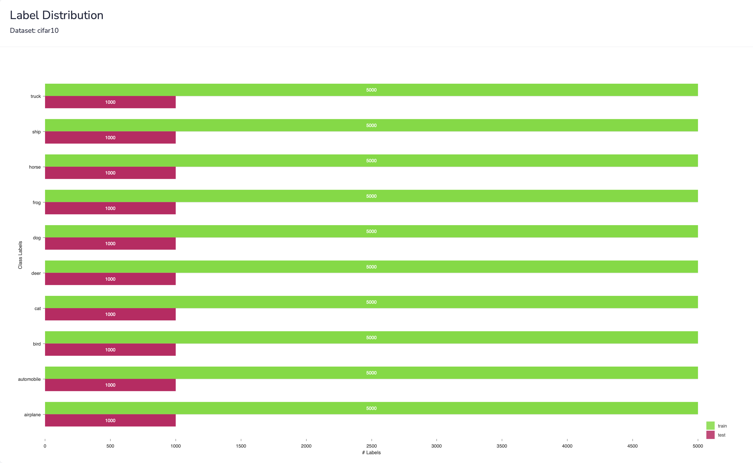
This plot is essential for analyzing the health of training datasets. Consider an example of a classifier that does well on most labels except for two. The first step is learning about the specific labels that have the worst performance. You might examine your dataset and find that your training split contains significantly less examples for these 2 labels than the rest, while having a high number of examples in the test split. This could motivate an adjustment of the dataset to increase the amount of training data for these labels.
Training Policies
In this page information on your training policies is displayed. You can see a table with all the policies produced by Masterful previously. Visualizations include parallel coordinates to visualize the policy search process, validation loss improvement, and per-label accuracy improvement. Each visualization has a dedicated section in this documentation with full details on how to interpret their values and meaning.
Searching For Optimal Policy & Parallel Coordinates
Masterful provides a parallel coordinates plot that describes the training policy search process performed by the Masterful AutoML Platform. While there is only one optimal policy produced, many other policy variations are examined and analyzed in the process, and the policy that yielded the best performance metrics is selected by the algorithm.
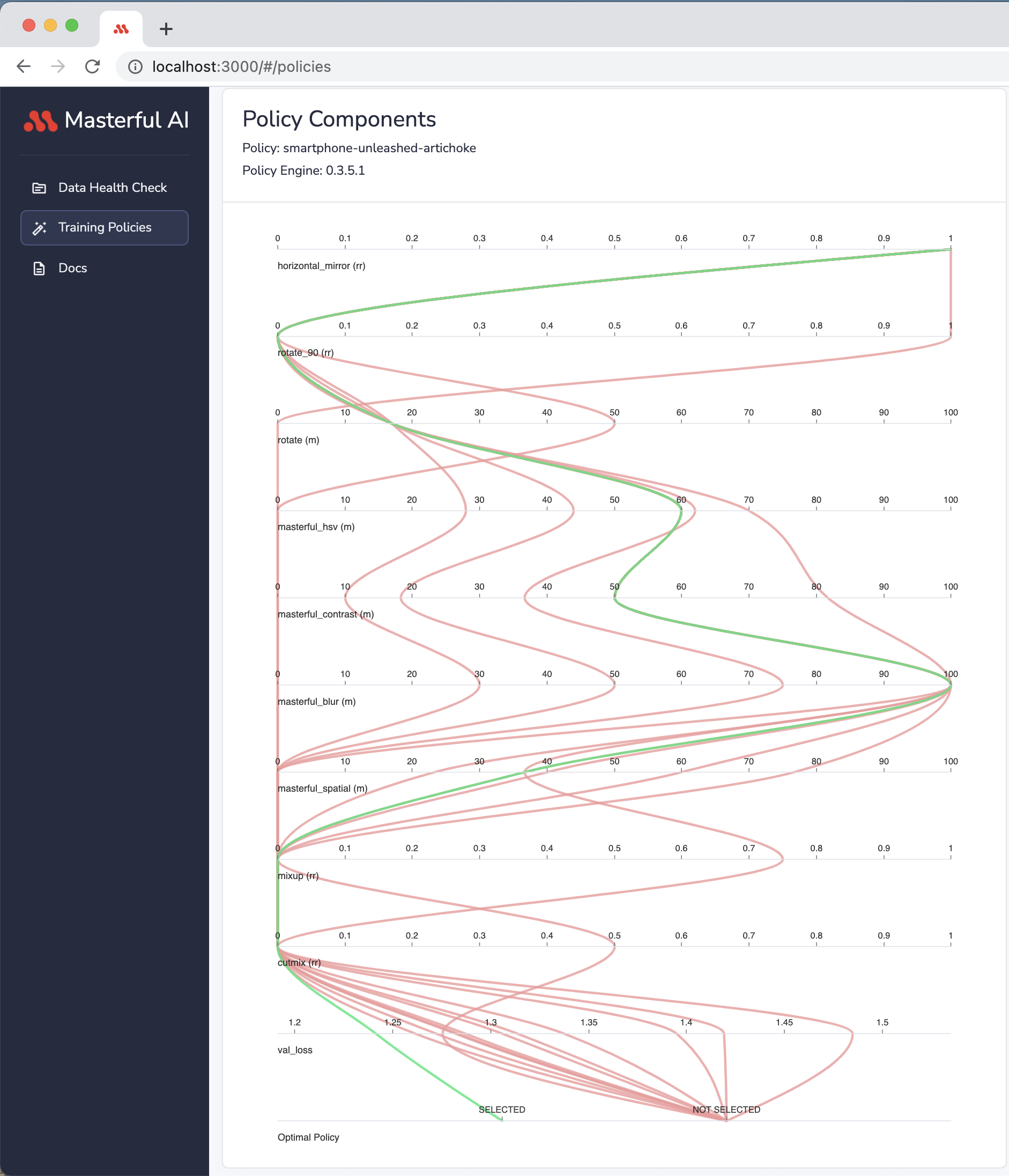
Via a parallel coordinates plot, you are able to see the various techniques used to produce training policies.
In the plot, each horizontal axis represents a single technique, or a compound set of techniques, that are included in the policy. The order of the horizontal axes doesn’t mirror the architecture of the model, but rather the order they were searched on by the metalearning algorithm.
There are 3 categories of values in the parallel coordinates plot. The Category is implied via a suffix to the horizontal axis legend:
Magnitude “(m)”: Each value on the axis shows the magnitude of the technique.
Replacement Rate “(rr)”: Each value on the axis shows the replacement rate of the technique. A replacement rate specifies the percentage of the dataset the technique is applied on. i.e. 0.5 means the technique was applied on 50% of the examples in the dataset, and the other 50% were not impacted by this technique.
Ratio “(r)”: Each value on the axis represents the ratio used for the technique. This is contextual. For example, a synthetic data blending with a ratio of 0.1 means the amount of synthetic data blended into the dataset was equal to 10% of the original dataset size. A dataset with cardinality of 100k examples, would have 10k synthetic data examples blended, and the total dataset cardinality, including original and added synthetic data, is 110k.
Validation Loss Improvement
This chart plots the impact of each technique in the policy on validation loss. By visualizing the impact of techniques individually on validation loss, developers can understand which techniques applied by Masterful most increased their model performance. This gives insight into the quality of the dataset as well as the selection of model architecture.
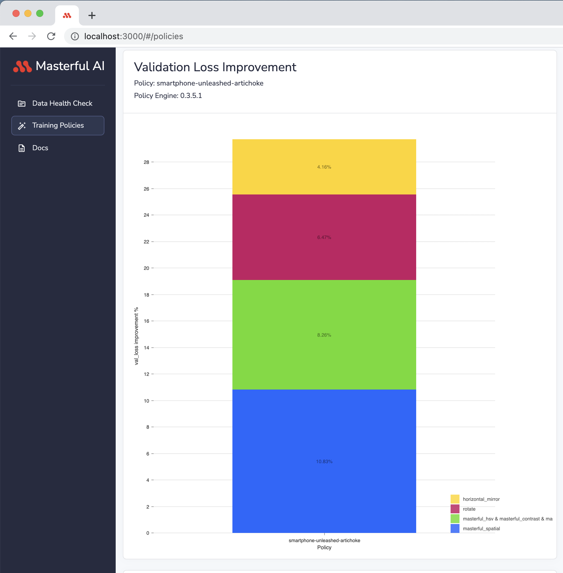
Some techniques are not included in this plot: this plot only visualizes techniques that yield positive impact on validation loss.
Accuracy By Label Improvement
This chart plots the model’s accuracy improvement per each classification label.
The overall model accuracy does not tell the full story about a model’s performance. By understanding model performance on a per-label basis, developers are better equipped to address specific weak points of their model accuracy in addition to applying Masteful. For example, this could include more targeted data collection for specific problem classes.
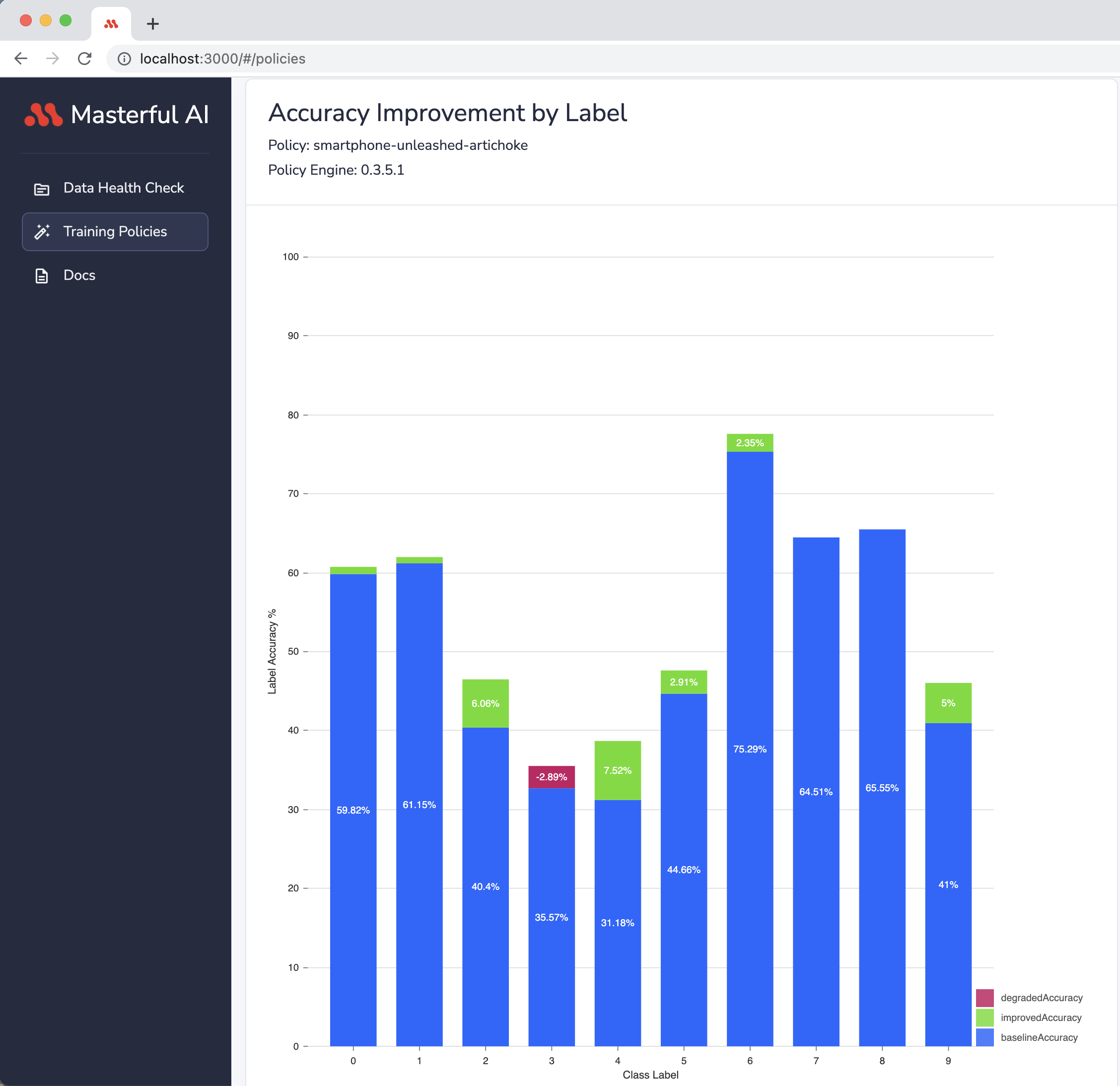
Consider for example a classifier model wih a good overall accuracy for a 10 labels use case. The model could be very good at classifying 8 out of the 10 labels, but bad at classifying the remaining 2 labels. By looking at the model’s accuracy alone, developers learn nothing about the model’s performance per label, and might not even be aware of the problem. This could lead them, in the pursuit of improving accuracy, to trying solutions that may not actually address the underlying performance problem, or even regress the performance of their model on other classes.